Alcohol Ink Background Christmas Cards
Welcome back to my blog!
I have some vibrant and colourful alcohol ink backgrounds to share with you today. I'll be using two techniques to create different looking backgrounds. Then, I dressed these backgrounds up with some die cut focal points and foiled/heat embossed sentiments. This is a great way to create many cards with very different looks! Not to mention I'll share two more inside card designs. This post is jam-packed with creative fun!
So let's get started!


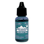
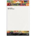
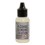
Working with alcohol inks is really fun and the best part is that you can always fix things and change the look of your panel by adding more blending solution. I'm using 5" x 7" Yupo in white cardstock and translucent paper. The only difference you get with the translucent paper is that there is a bit of a see-through feature only if you use light coloured inks. I was simply running out of white cardstock Yupo so that's why I used this transluscent paper. I used dark colours so the effect wasn't any different from the white cardstock. You will also need blending solution - you can use Ranger's Alcohol Blending Solution or you can use 90% isopropyl alcohol/rubbing alcohol. I have 99% only because I could not get a hold of anything else. I just have to make sure my room is well ventilated and I have a balcony outside my craft room so that works out fine for me. With the IPA, you will need a couple pipettes. You will also need a blower - I used We R Memory Keepers Marker Airbrush. The most important items are your alcohol inks. I use the Ranger alcohol inks and one item that is a game changer is the Jacquard Pinata Brass alcohol ink! This is not like the Ranger mixatives but behaves more like an alloy. This one is so nice and the beauty of it is that it doesn't blend with the rest of your alcohol inks, but creates a metallic wall so to speak. This helps it stand out in your backgrounds. The colours I used for each panel are as follows:
1) Cloudy Blue, Sailboat Blue, Pool, Brass
2) Amethyst, Pool, Sailboat Blue, Brass
3) Stream, Sailboat Blue, Pistachio, Brass
4) Shell Pink, Cloudy Blue, Perri, Silver Mixative
There are two techniques that I used to make these backgrounds and they are as follows:
Technique 1 - Put down a generous amount of blending solution or IPA and then add drops of your desired colour. Add the brass drops on top of the coloured ink and blow this around the panel. I usually try to fill the entire panel with colour because I wanted a full vibrant look. Then I add drops of colour, brass and IPA to move the ink all over with the blower. I build the colour up in layers in this manner until I'm satisfied with the look and if there is something I don't like, I just add some more IPA which moves the colour around again. You can decide to stop when you see fit. This is really a haphazard way of doing this but it yields beautiful results.
Technique 2 - This is similar to the last technique but there is more strategy to this one. This is what I called a geode background because it ends up looking like a geode. Like in the first technique, put down a generous amount of blending solution or IPA and then add drops of your desired colour. Add the brass drops on top of the coloured ink and blow this around the panel. Once the panel is covered in colour I drop 3-4 droplets of 1 ink colour randomly on the panel. On top of those drops, I add drops of brass and then blow it out to create a concentric circle, so I'm really blowing straight down directly over the drop (this can be easily seen in the YouTube video linked above if you need a better idea). Then I'll add the next colour and brass and blow it out in the same manner to create another circle. Then I go back to the first colour and add brass and blow. I continue in this manner in the same sequence of colours to create the concentric circles. And since the brass acts as a wall of metallic colour, it creates the geode pattern.


I used so much ink on my panels to help build my colours so I had to let these dry overnight. Next I made my sentiment strips. I used Spellbinders Yana's Christmas Sentiments foil plates to foil sub sentiments in Spellbinders Polished Brass foil. I also foiled the main Merry Christmas sentiments with the same foil. I did these on Sizzix Gold Pearl Cardstock which is nice because it has a gold sheen in the light. I also used the sentiment strip die from the Spellbinders Holiday Sentiments set to cut the sub-sentiments out. I made enough for 2 cards and then I used the Simon Says Stamp Stained Glass Greetings stamp set to heat emboss with Ranger Princess Gold embossing powder, one more sentiment.
On the first two cards, I used the more blue backgrounds and a beautiful Star of Bethlehem die. (I have linked something similar as I'm really unable to find this one anymore.) I die cut the star in Sizzix Gold Mirror cardstock and white cardstock. I positioned and adhered these and the foiled strip sentiments to the background panels with Simon Says Stamp adhesive tape and foam squares.
For the third card, I adhered the embossed sentiment strip and the Simon Says Stamp Geometric Christmas Tree Die cut out of Sizzix Gold Mirror Cardstock. For the final card, I adhered the ornament die cut out of Sizzix Silver Matte cardstock. (This is also an older die of mine and will link something similar). I used the string die cut and bow from the Spellbinders Deck The Halls die set. I also adhered the foiled sentiments which were done with Spellbinders Silver foil on Sizzix Silver Pearl Cardstock.
I embellished all of these card panels with Pinkfresh Studio Jewels in matching colours (white, light blue, brown) and Gold LolliBeads gems.


For the card insides, I chose to stamp out some images in coordinating coloured light inks to create a subtle watermark effect. This way there is a nicely stamped image to decorate the inside without taking too much away from the front of the card. I used the Honey Bee Stamps Farmhouse Tree Builder stamp set to stamp out the tree in 3 layers: Altenew Morning Frost ink, Altenew Eastern Sky ink (card 1) and Volcano Lake ink (card 2), Encore Ultimate Metallic Gold ink. This was done on 2 cards. For the other 2 cards I used the Altenew Bountiful Branch stamp set. I stamped out 2 overlapping branches with the help of post-it masking. The layers were stamped in the following inks:
layer 1 branch stem- Altenew Evening Gray ink
layer 2 branch leaves- Altenew Morning Frost ink
layer 3 branch leaves- Altenew Ocean Waves (card 3), Altenew Carribean Sky ink (Card 4)
layer 1 berries - Altenew Morning Frost ink
layer 2 berries - Altenew Frosty Red
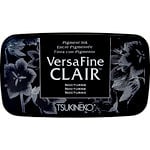
For the sentiments, I used my go-to Altenew Blessings stamp set stamped out in VersaFine Clair Nocturne Ink. I then used the scripty "Merry Christmas" from the Sunny Studios Christmas Trimmings stamp set. And I stamped these out in the respective coloured inks used for each card. After attaching the front panels to the card bases, which were 5" x 7" center-folded out of white cardstock, my cards were complete!
This is such a great method for churning out a bunch of brightly coloured Christmas cards. The backgrounds don't take long to make and I guarantee you that once you get out the alcohol inks, you will be hooked! You can make dozens of backgrounds in seconds and some simple sentiments and die cuts make these cards complete!
I hope you were inspired! And as always, thanks for stopping by. Don't forget to leave me a comment, as I love hearing from you!


- Tsukineko - VersaFine Clair - Ink Pad - Nocturne
- Price: $7.91
- Embossing Powder Princess Gold, 1oz Jar

- Price: $4.99
- Tsukineko - VersaMark Watermark - Stamp Pad

- Price: $7.39
- Bearly Art - Precision Craft Glue - The Original

- Price: $14.99


- Ranger Ink - Tim Holtz - Alcohol Ink Storage Tin

- Price: $9.49
- Ranger Ink - Tim Holtz - Alcohol Ink - Air Blower
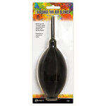
- Price: $10.79
- Ornament Swirls Die Set

- Price: $11.95


Comments
Post a Comment
Please leave me a comment as I always love hearing from you! 😃